As a developer I am always passionate about a good User Experience. During my day-to-day job I felt sometimes that listening to the users’ voice was not always a priority or in balance with business goals. I wanted to build a product that focuses on the user first and potentially can generate business value purely out of it’s value to the user. Like it is mentioned in the principle #1 in Google’s “Ten things” Philosophy.
So I started my side-project Visual Timer to learn what it’s like to publish/distribute a product on the one side (learning about ASO, handling Releases,…) and iterating the MVP after it’s shipped – by applying different UX principles – on the other hand.
Inspired by a mention of a timer utility in the book “Sprint” by Jake Knapp I decided to build a timer app that focuses on the visual representation of the time to support time-boxed tasks in different situations. The principle was not new at all but I could not find a decent Android app and therefore decided to create one on my own.
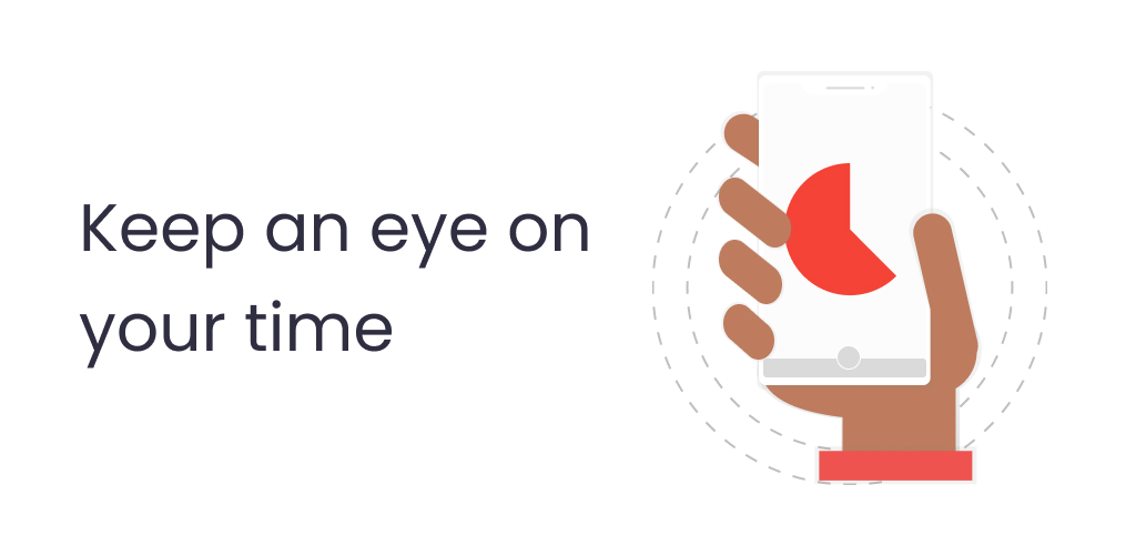
The mission was to create a clutter-free app which enables users to quickly start a timer and utilise the visual representation in order to stay focused on their task and having a concise feeling about the progress of time. The app should stand out by it’s simplicity and easy of use.
Do not re-invent the wheel
The suggested utility in the book was the main product of Time Timer. Back then they already had an Android app but the reviews were not that good. This was already valuable feedback for the MVP.
The concept of providing the time as a segment of a circle seemed already to be proven a good way to communicate it to the user as most of the timer apps utilised this representation. It even can be understood by users like children who haven’t learnt the concept of time yet (I got reviews of users who especially liked it for the use with children). That’s why I adopted that kind of UI element.

Setting up the timer directly in that circle wheel by tapping or swiping to the desired duration supports the principle of cohesion and eliminates a separate input mechanism. I could have also added additional inputs like the stock time picker, but decided against it for simplicity. If it would have been a major thing to be missed by users it would have turned out quite fast.
Starting with a MVP and constantly improve it
The goal of the MVP was to provide the simple and quick setup of timer as well as the ability to use presets for commonly used timers.
Initial features for the timer part where:
- Setup timer either in seconds or minutes (up to 60 minutes)
- Show initial duration while timer is running
- Keep screen on while timer is running
- Notification for quickly accessing a timer while running
Next to customising the alarm sound it was possible to add vibration once the alarm is triggered.
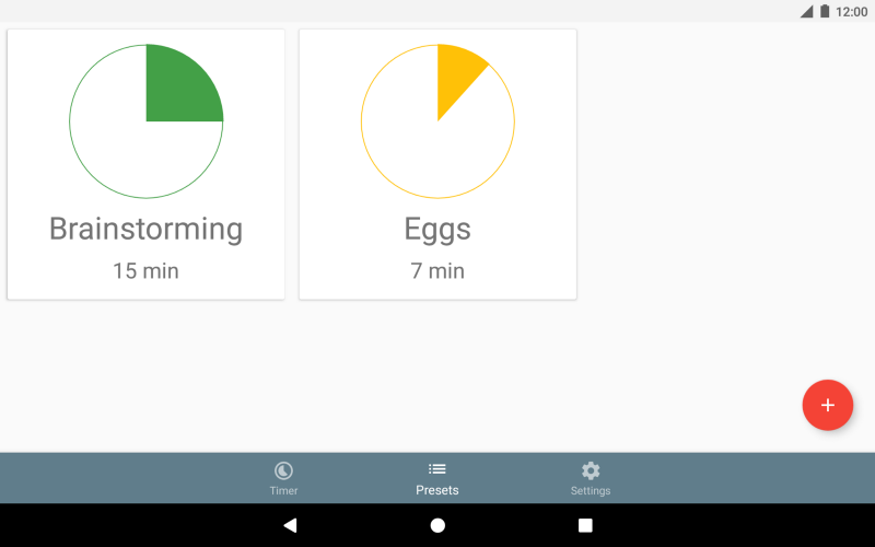
One feature which was well appreciated from the beginning was the ability to add presets for commonly used timers. This allows users to give context to certain durations and enables quick access for frequently used time-spans.
Clockwise vs. Counter-clockwise
Having the core components in place the question of the proper direction for the timer wheel popped up. For me it was fine to do the input in the counter-clockwise direction as then, when the timer is running, the time progresses in it’s natural clockwise direction.
Turned out pretty quickly that this was not the case for everyone.
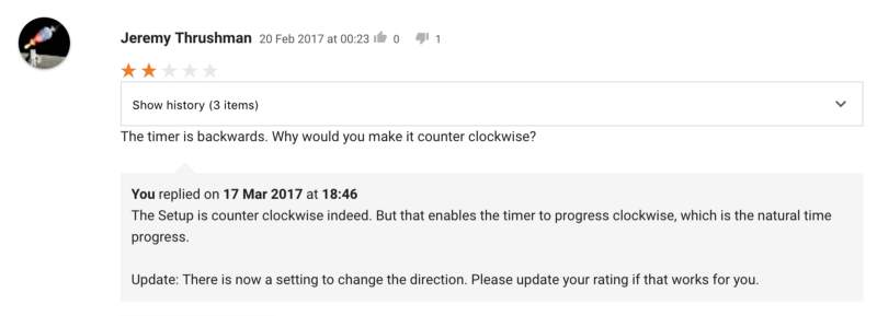
Within the first 7 days I got this review. My assumption of providing the proper direction (for most users) was proven wrong. At first I responded with an explanation why it was counter-clockwise to justify my decision. But after another thought it was clear to me that the timer direction is a crucial part of the application and simply cannot be decided by me for all users. So I adopted the functionality and provided a setting to choose the preferred direction, but I kept the counter-clockwise direction as the default one.
But to be clear: Blindly adding settings because of user requests is not a good practice. There’s a good article on that matter here.
Be careful when making decisions for users. React if you’ve done the wrong thing in the first place
Detour: Dealing with Reviews
Having a feedback channel through user reviews in the app store it should be utilised to constantly check the feedback and adapt the product in case .My assumption is that if one user writes a review about a problem that a way higher number of users actually have that problem too but do not articulate it. (You should provide a additional channels for user-feedback. More on that in a few lines)This is of course not doable for feature-requests. Here you would need to dive a bit deeper and analyse the actual need of the users with qualitative or where possible quantitative user research.
My advice would be to always have a close eye on the reviews of the app-store. First, reading 5-star reviews is kind of a compensation for the hours you invest in your product 🙂 Secondly, you get user-feedback in a pretty convenient way and also can respond and show that you are actually listening for feedback.
When to respond?I think you can respond in a lot of cases. If the review is praising your app, you could respond and show gratitude (clearly this is not something you should do for all 5-star reviews). For 4-start ratings it could sometimes make sense to follow-up with the review and ask why they didn’t gave 5 stars. For 3-star and lower ratings it definitely makes sense to reply. Not only you help the reviewer if they report a problem but also show again that you care about their feedback.Of course there are also 1-star ratings which are not productive at all. It does not make sense to start arguing here, you most probably cannot change the reviewers mind.
Shipping incremental Improvements
In the first months after releasing the initial Version of the app there were a number of improvements shipped.
Some features didn’t make it to the MVP but were already planned as next step. But more importantly I provided an additional feedback channel for user to make feature requests or report issues. This was available through a menu option.

I’m using a tool called UserReport to track those requests. It provides an overview about most requested features and pain points. Those are continuously checked and considered for upcoming releases.

With that in place there were 28 updates shipped in the last 16 months.Here’s what happened:
After bugfix-releases in the first two weeks the first improvement was shipped with Version 1.1 (direction setting).
Tablet support
In order to get out the MVP out quite quickly there was no tablet optimisation done in the first place. In Version 1.2 I shipped some layout adoptions for tablets. Additionally user feedback regarding timer presets was incorporated. The ordering of the timer presets was inherently defined by the creation date of the preset. This was changed to consider the usage of the presets and so the most used presets are ranked to the top now.
Pause & Resume
With Version 1.3 a next top-requested feature was implemented. The ability to pause and resume the timer. This sounds quite obvious but again is a good iteration on the MVP by listening to the users needs.
Dark theme
In 1.4 support for a dark theme was added. It was reported that the white theme is too bright for certain conditions. On top there was a setting added to control the alarm volume. Per default the system alarm volume is used, but users reported that some devices cannot handle the system volume properly therefore this should also allow those users to control the volume within the app.

App-Shortcuts
1.5 brought support for Android’s app-shortcuts. This was introduced with Android 7.1 making it possible to provide shortcuts (deep-links) to content of the app directly from the devices home screen (launcher). By adding support for deep-linking it was also now possible to start a specific timer preset or duration by opening a deep-link (e.g. visualtimerapp://duration/60 or visualtimerapp://preset/brainstorming ). This also comes handy if you want to start a timer under certain conditions with a task management app like Zapier.
")
Landscape support for phones
1.6 The app was designed in for phones in the first place limiting to portrait use. Landscape support was added for tablets in Version 1.2. Turned out that also phone users still want to use the app in landscape mode which was added in this release. Recently a user complained that the app is switching to landscape and this harms the experience. So again there are two opinions on a certain setting. Here again starts a dilemma. Should you add another setting to give the user the power to choose it’s preferred orientation setting is it better to limit the amount of settings and not overwhelm users with too many options. This is still an open decision right now.
Haptic Feedback
With Version 1.6.3 another small adoption was made. When selection the duration a haptic feedback (vibration) is triggered whenever a 5 minute-step is passed. This should provide a more tangible and precise way of selecting the desired duration. This “feature” was enabled per default and there was no ability deactivate it. Through user-feedback it was again articulated that some users did not like this haptic feedback and wanted a way to disable it. Additionally I experienced that this vibration wasn’t handle the same across devices. The implementation was issuing a vibration of 20ms but turned out that the actual (felt) vibration is highly dependent on the hardware and some devices have lazy vibration motors so that it is hardly noticeable on those.So I was looking for an alternative way to provide this haptic feedback. Luckily the Android system provides an API for issuing such feedback. Mostly known by keyboard implementations where you get that feedback while typing. Using this API I could on the one hand fix the issue of inconsistent experience (the system is taking care of a reasonable vibration in that case) and on the other hand had the opportunity to use the system setting for haptic feedback and could rely on the system setting without adding another option inside the app.
Driving installs
In the last half year the monthly growth rate was steadily around 10%. Installs are mostly organic as I do not spend any money on user acquisition.

Optimising the app store entry is then a crucial task.
Translations
With Version 1.3 I also added first translations for French and Russian (next to English and German). This was possible by crowd-sourcing the translations through an in-app message. There’s a dedicated article about how to crowd-source translations. This made it possible to add other languages in the following months so that currently the app and the store entry is translated in 8 languages.
For optimising the App store presence I tried to do a promo video for the app. Unfortunately it turned out that it didn’t had a big impact. Still I had some learnings of actually creating the video. I summarised that in an article which also got selected for the well-known Android Weekly newsletter that drove a lot of views.

As it turned out that the direction of the timer progress is crucial to users I also wanted to know it has an impact on the visuals of the app store. They were done in the counter-clockwise direction but as the preferred direction is clockwise, I re-did the app-icon an ran an A/B test. As you can see below there was no clear winner.

This makes me think if it is more important to have a visual pleasing icon than a strong link to the actual content/domain.
I ran another test with a simplified icon and it turned out that it got around 17%-35% more installs
")
Some Numbers
In the past 16 Months Visual Timer grew to 40.000 installs and has currently around 760 ratings with an average of 4.6.Installs are nearly entirely acquired through organic installs from the Play store.
Currently there are 12.400 monthly active users at 20.000 active installs.
Tablet users make up 11,4% which is quite ok, respecting that tablet devices haven’t been pushed from Google and OEMs for quite some time.
In nearly 28% of all sessions there is a preset started, which shows the importance of the ability to have custom presets for users.
What’s up next?
Countdown Limit of 60 minutes
Currently the visualisation and the setup process restrict timers to a maximum duration of 60 minutes. There users complaining about that fact and requesting timers longer than that.
There would be the possibility to allow longer durations by changing /adding another input method and making the circle showing the duration relative, meaning it is fully filled with the selected duration and then constantly shrinks. (which by the way was requested also independently of the maximum duration — supporting this could still be combined with the existing input method)Currently I’m not convinced go for those changes as it is not supporting the core use-case and I don’t want to harm the experience on that by adding too much noise. I anyhow highly doubt that this app should be used for countdowns longer than 60 minutes and users should be better of using other Timers for those use-cases.
For now this additional support is therefore not planned, but noted for another evaluation at a later stage.
Reducing App-size
It is commonly known that the install rate drops if the app-size increases. This was emphasised by Google recently and they launched a new way of providing your app in the Google Play Store. They introduced a system which is shipping a tailored app respecting the devices configuration (Hardware, Language,…) in order to omit unnecessary code. It was clear to try this new feature for my app as I was aware that the app-size could be optimised. In my case the new tooling can save up to 64%. Unfortunately the feature is still in a preview stage and is currently causing problems on specific devices so I had to back off and need to wait to get it stable. I wrote a dedicated (technical) story about it here.

NFC Support & more
Adding support to start timers from NFC tags could also be a nice add on. Having tags in place for regularly used presets it would be handy to start those by just holding the phone/tablet to that respective tags. This would also need to be validated with e.g. surveys upfront.
Managing presets could be enhanced as well (and was also requested already). Editing existing presets and changing sort order of the presets manually would be possible improvements.
On the research side it would be interesting to target in-app message to power-users and ask them actively for feedback and improvement ideas.
If time permits I’ll continue to ship improvements regularly and also have a look into ways of further growing the audience.